| Red Roses |
| Home Page | Painting Selection | White Roses | Multi-colored Roses | Yellow & Orange Roses | Other Flowers | Commissions | Contact Me |
 Continued
from the front page... Continued
from the front page......I use as many as 5 or even 10 other types of red pigments to create the true red of the rose and the true intensity of the feeling of the painting. Red roses are always special. Red roses seems to represent romance and love among the many feelings created by roses and their likenesses. I feel an intensity with red roses. I usually try to include the artist’s paint color Alizarin Crimson in each painting. I use as many as 5 or even 10 other types of red pigments to create the true red of the rose and the true intensity of the feeling of the painting. Each of the colors is added as a layer over the rose. These layers are transparent and the process is sometimes referred to as glazing. Rembrandt was one of the first to use this process in portraits. Layering takes a lot more time but gives a deep and powerful color and is well worth the effort. |
|||
|
|||
|
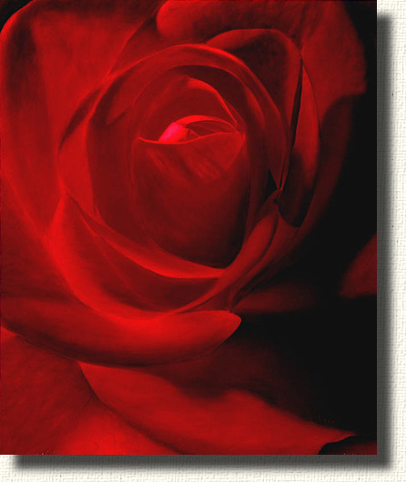
Ingrid The painting to the right is of the rose called "Ingrid Bergman". Ingrid is a beautiful rose and an important part of our garden. The red in Ingrid is so intense it is difficult to photograph - it over powers the camera. I usually work from both the real rose and from photographs. This painting is typical of my painting style. I like to call this the "bee's eye view". I like to place the viewer almost inside the rose. Looking at the painting from a distance is appears as a rose but up close - as a bee would see the image it becomes an abstraction. It also becomes another world - the world of the rose. I use transparent colors when I paint roses - especially red roses. Ingrid started as a black and white painting. Layers of very transparent reds were applied over weeks to find the right color and intensity. This painting is sold and was 42" x 32", oil on canvas. |
 |
||
|
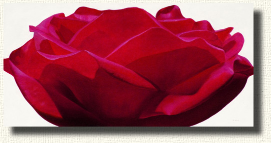
Mr. Lincoln This painting, to the right, is of Mr. Lincoln - one of my favorite roses. I was introduced to this rose by my grandmother many years ago. Mr. Lincoln has is slightly to the blue or magenta side, especially glancing light off the petals. The red is deeper and more blue than Ingrid. This is a place where layers of blue are over layers of red until the right color is obtained. |
 |
||
|
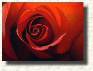
Composite This rose was a white rose originally. I liked the shape so much I painted the white rose first and then laid the petals with reds and oranges. Yes, it did shift somewhat to the orange side of red. |
 |
||
| Home Page | Painting Selection | White Roses | Multi-colored Roses | Yellow & Orange Roses | Other Flowers | Commissions | Contact Me |